Update 2013 Nov 05: Added animation.
Several years ago I saw a post about a Lamborghini Reventon dashboard design. Of course, I liked the Blade Runner look, but I was drawn in particular to the lines between the tachometer and gear-indicator. These lines suggest a relationship between the engine and transmission but it is only a suggestion. The very first comment on that post criticizes the display for that exact reason, among others. I, on the other hand, thought that a useful link could be made between these two gauges. To express the link between rpm and gear, I needed to find a way incorporate the other related value, speed.
A new kind of dash display
What I wanted to show was the link between rpm and speed through the current gear ratio with each scale fixed as it would be on a traditional gauge. I wasn’t even sure it was possible to do. After some thought and experimentation I came up with this:
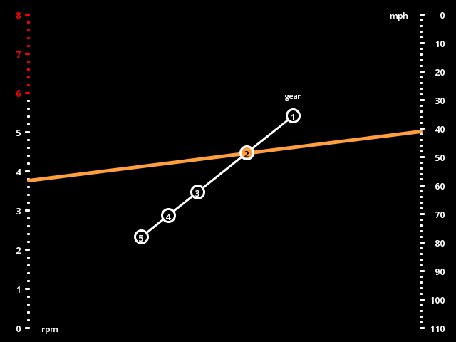
In this layout, while engaged in a gear, as the rpm rises and speed rises the line between them will pivot about a fixed point along the diagonal which is where the gear-indicators naturally go.
I stuck with traditional vehicle dash colors and styling to highlight what is different about this display instead of distracting with color and style changes.
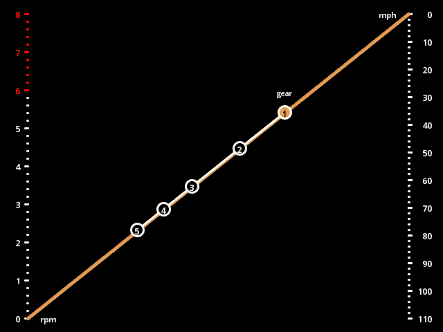
Dash in action
Here we can see the dash in action including a subtle shift light incorporated into the current gear indicator:
So what’s the big deal?
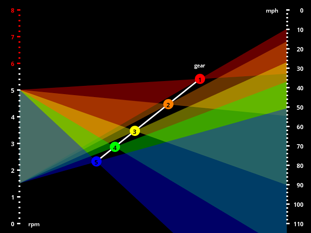
The reason that this display is so compelling to me is that it seems to be connected to the underlying physical process in a richer way. With this richer connection, more information than just the three nominal values is made available. For example, if the rpm rises without a corresponding rise in speed then we have something going on like wheel spin or clutch slip, and this will be indicated by the line not crossing at the gear indicator. Also, without the vehicle even running, we can see information about the effective gear ratios by projecting a reasonable rpm range through each gear to see the useful speed range in each gear:
Nomography
After I had this layout worked out, I ran across this article on the field of nomography. It turns out I had stumbled upon a type of chart that has seen use before; it is called a Z chart or N chart (for obvious reasons). Various mathematical relationships can be expressed on a 2D surface in a nomogram. I imagine that these type of charts were very useful visual calculation devices prior to the advent of personal computers. Perhaps they can serve us again in the form of interactive data-visualizations.